
SIMPLE DE USAR
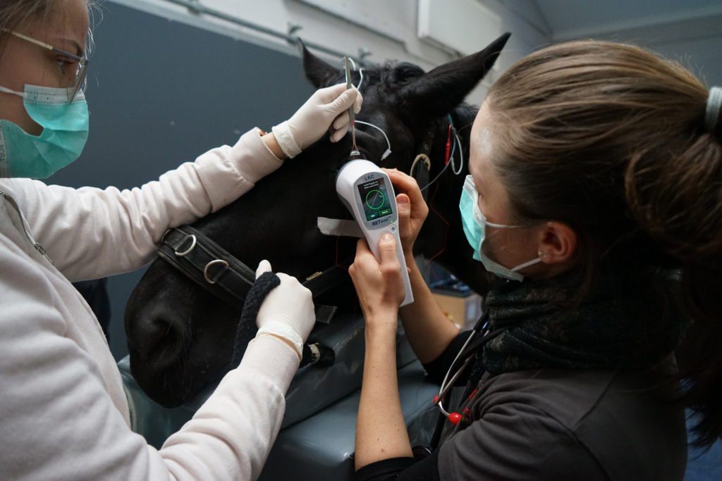
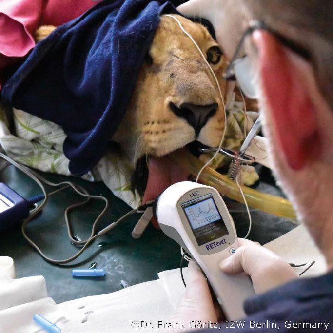
- De mano, ligero y portátil
- Capacita a los técnicos en minutos
- Se entrena a los técnicos en minutos
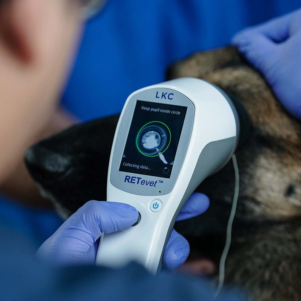
- Monitorea la conexión de los electrodos y el control de la luz ambiental
- Compatible con Mac y Windows

Pruebas avanzadas
- Funcionalidad avanzada de campo completo en un dispositivo ERG de mano
- Gama completa de protocolos de prueba, incluyendo ECVO e ISCEV
- Protocolo de reflejo luminoso pupilar incorporado

PRUEBAS DE CONFIANZA
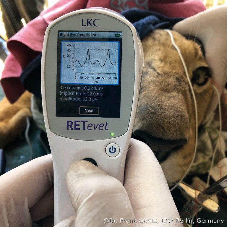
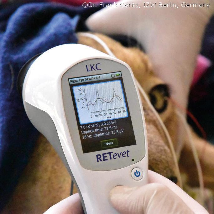
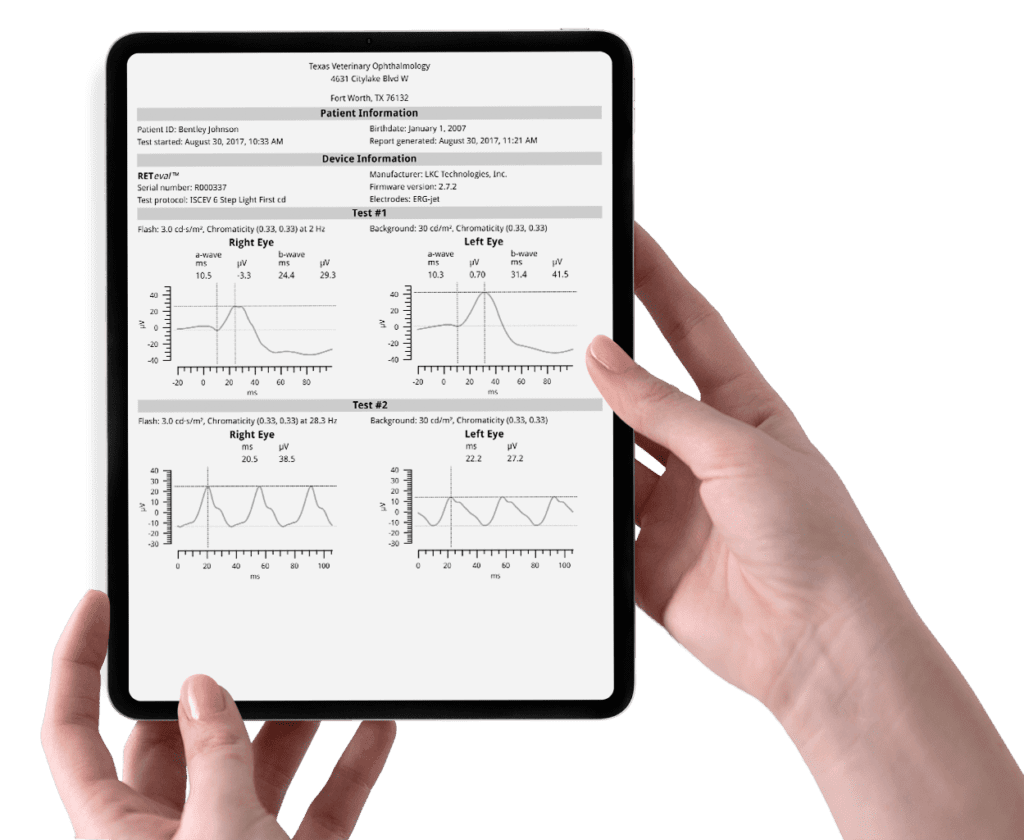
- Extractor RFF para exportar datos en bruto: valores del cursor, formas de onda eléctricas y de la pupila et
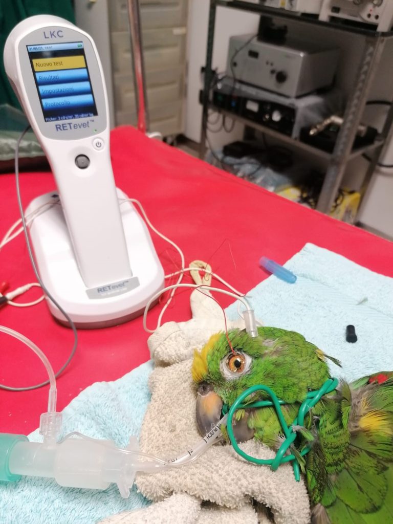
- Protocolos de investigación integrados para roedores
- Protocolos diseñados a medida para un estudio específico o aplicación de investigación
- Aplicación de código de barras de pacientes para introducir múltiples variables/identificadores de pruebas

Impulsar la investigación
- No invasivo y altamente transportable para una máxima eficiencia y cumplimiento
- Consiga un seguimiento de puntos finales de rendimiento superior con resultados consistentes y fiables
- Los registros de auditoría integrados y los protocolos de prueba fijos facilitan el cumplimiento de las BPL y las BPC
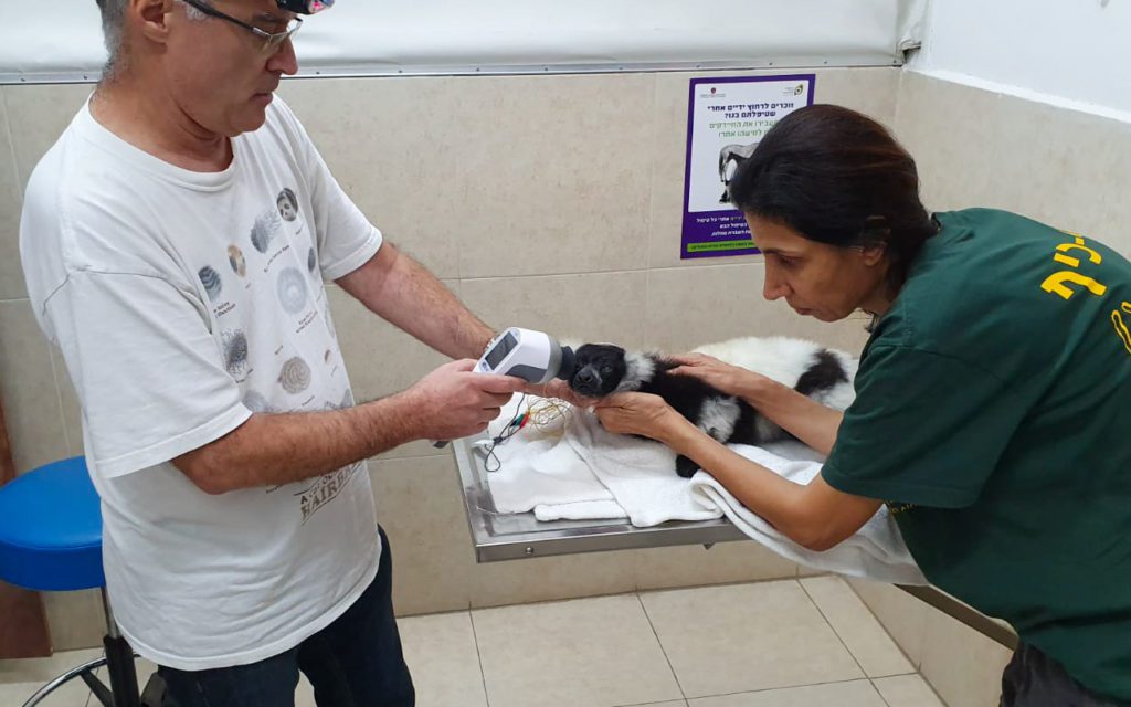
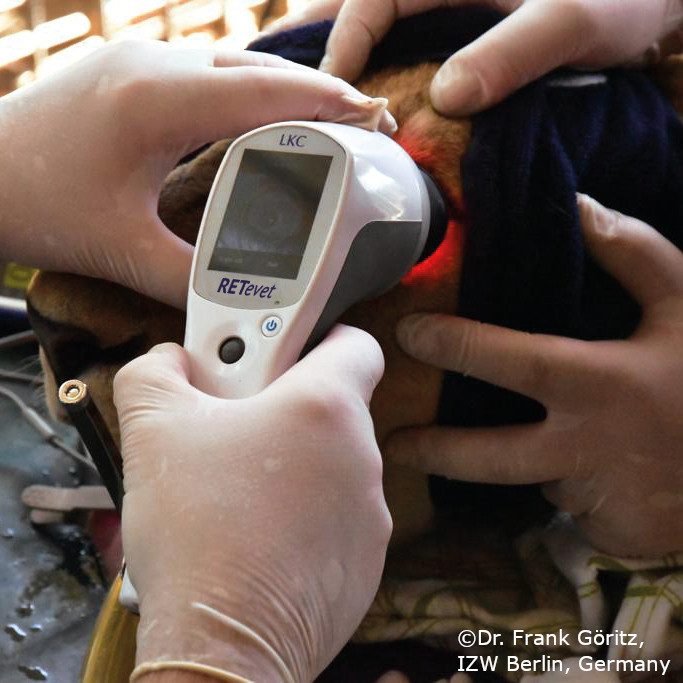
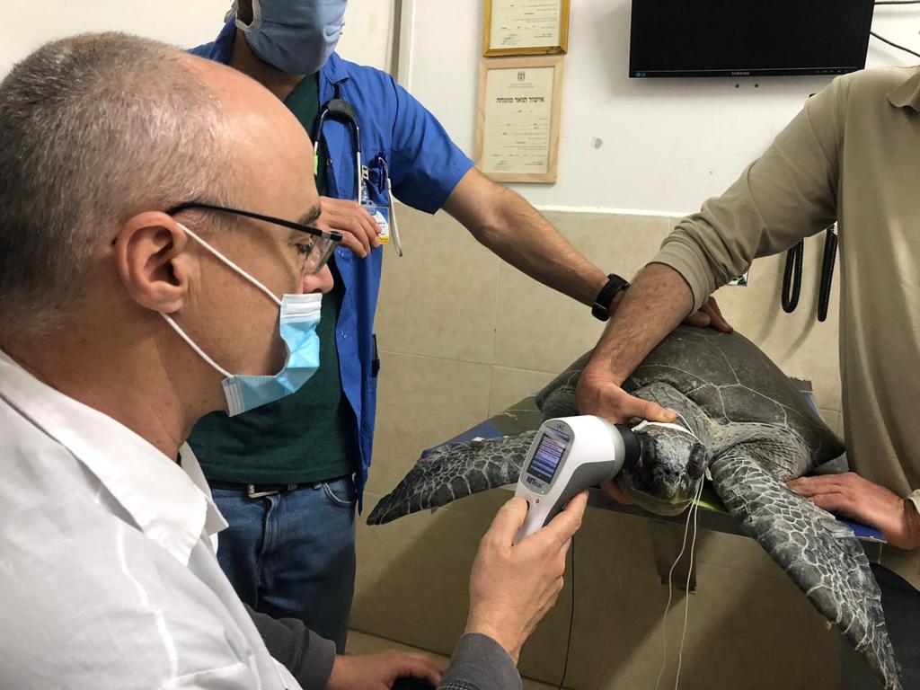
- Adecuado para múltiples especies


I enjoy the RETevet’s ease of use and portability. The first time I started the device I was able to perform an ERG with no help at all from LKC. We are now performing ERG tests with RETevet in patients with no sedation at all if it is indicated or owner denies sedation.

As someone not familiarized with ERG, I was surprised with how easy it is to perform ERG tests with the RETevet. The real-time view of the patient's eye during testing and the way the device monitors electrode connection allows me to control all crucial parameters for successful measurement. I can perform most of the light-adapted tests without sedation with ease due to the fast and efficient testing protocols.

I added the RETevet device to my practice because of the ease of use, portability, and ability to get repeatable test results. In my experience, LKC products have less variability in test results, making the RETevet perfect to use between my practice locations to get the same results for all our patients. In my mind, the RETevet is superior to other systems in the field, both with respect to accuracy and reproducibility, and with an ease of interpretation that is surpassed by none.